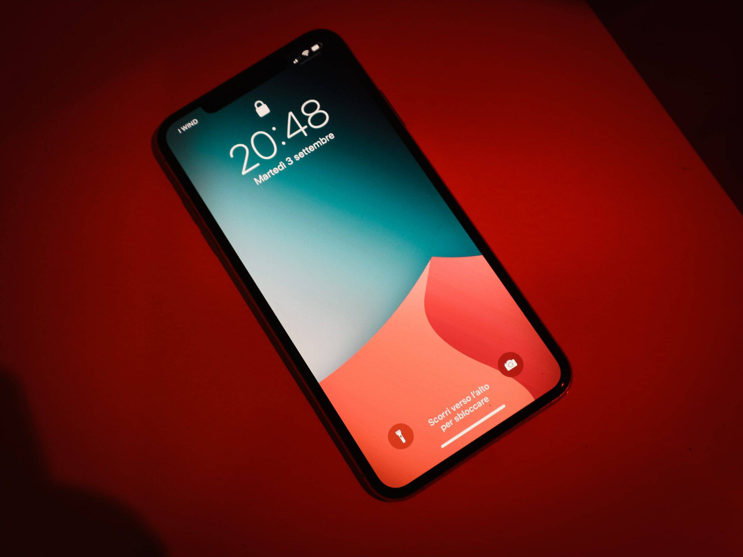
Responsive Design
Mobile internet usage has been skyrocketing over the last few years. However, the vast majority of business websites are still not mobile-friendly. This turns into a loss in a business opportunity. Responsive design requires you only have one website that is coded to adapt to all screen sizes, no matter what device the website’s being displayed on.
Responsive design is a term originally coined in a 2010 A List Apart article by Ethan Marcotte and is a widely used method for designing a mobile website.
Here are some key undeniable reasons for why your site should be mobile responsive.
Mobile usage is exploding.
- A brief review of these stats from Smart Insights will ignite the need for a mobile website.
- Over 30% of Google searches are conducted on a mobile device.
- In 2012, more than half of local searches were performed on a mobile device.
- In the United States, 25% of internet users only access the internet on a mobile device.


A positive user experience is a must.
If a user lands on your mobile website and is frustrated with the non-responsive navigation, there’s a 70% chance they will leave immediately and go to another website (most likely a competitor).
Social media activities bring mobile visitors
55% of social media consumption happens on a mobile device.
Responsive design is key for SEO.
Google has gone on the record to declare that Google SEO ranking prefers responsive web design over none.
Responsive websites adapt to future devices.
One of the big benefits of responsive design is that the size of the template is designed based on screen size, not the device. This means that no matter what size screen someone is viewing your website, it will display properly for that screen size.
JLB has done many responsive website designs, in fact, all websites are designed with mobile in mind, and also works to take existing websites and redesign them into a mobile-friendly format.
As you see below, two key businesses in Franklin, TN recognized that their traffic was over 50% mobile and they were losing the attention of site visitors which was a frustration for loyal users and a deterrent for new clients.
JLB worked with the clients to build intuitive and responsive platforms to help elevate their user experience and capture a broader customer audience.
Want a mobile responsive website? Contact JLB Florida today.
We Get You More Business!
We Get You More Business!
- For years, brand creation, website design, web development, search engine optimization, and pay-per-click management have been the cornerstones of our firm.
- These services also include related specialties such as logo design, graphic design, mobile responsive design, and various other website design, development, consultation, and digital marketing solutions.
- As we’ve continued to grow as an agency, adding more experts, and evolving into new service areas, we’ve become well known for additional, complementary services, such as social media marketing, email marketing, local search listing optimization, advertising, and public relations services.
